Opportunity Insights
Eli Grosman, Mazama Science
February 9, 2020
Source:vignettes/articles/Opportunity_Insights.Rmd
Opportunity_Insights.RmdObjective
The goal of this document is to illustrate how MazamaSpatialPlots can be used to easily recreate state or county level choropleth maps found on the web.
Throughout this document, we will be using data provided by Opportunity Insights; specifically, the data used on their Economic Tracker web app.
Obtaining Data
All of the data we will use is easily obtainable from the Opportunity Insights GitHub repository. We can use read.csv() to load data directly.
# COVID data by US county
URL1 <- "https://raw.githubusercontent.com/OpportunityInsights/EconomicTracker/main/data/COVID%20-%20County%20-%20Daily.csv.gz"
URL2 <- "https://raw.githubusercontent.com/OpportunityInsights/EconomicTracker/main/data/Zearn%20-%20County%20-%20Weekly.csv"
countyCovid <- readr::read_csv(URL1, col_types = cols())
countyMath <- readr::read_csv(URL2, col_types = cols())
head(countyCovid)## # A tibble: 6 × 20
## year month day countyfips new_case_count new_death_count case_count
## <dbl> <dbl> <dbl> <dbl> <chr> <chr> <chr>
## 1 2020 1 21 1001 . . .
## 2 2020 1 21 1003 . . .
## 3 2020 1 21 1005 . . .
## 4 2020 1 21 1007 . . .
## 5 2020 1 21 1009 . . .
## 6 2020 1 21 1011 . . .
## # … with 13 more variables: death_count <chr>, new_case_rate <chr>,
## # case_rate <chr>, new_death_rate <chr>, death_rate <chr>,
## # fullvaccine_count <chr>, vaccine_count <chr>, new_vaccine_count <chr>,
## # new_fullvaccine_count <chr>, new_vaccine_rate <chr>, vaccine_rate <chr>,
## # new_fullvaccine_rate <chr>, fullvaccine_rate <chr>
head(countyMath)## # A tibble: 6 × 9
## countyfips year month day_endofweek engagement badges break_engagement
## <dbl> <dbl> <dbl> <dbl> <chr> <chr> <chr>
## 1 1003 2019 1 13 -.159 -.165 .
## 2 1003 2019 1 20 -.191 -.248 .
## 3 1003 2019 1 27 -.404 -.458 .
## 4 1003 2019 2 3 .388 .125 .
## 5 1003 2019 2 10 .35 .395 .
## 6 1003 2019 2 17 .354 .609 .
## # … with 2 more variables: break_badges <chr>, imputed_from_cz <dbl>We take a moment here to laud the people making this data available in a format that contains all the information we need and is easily ingestible using standard techniques. This kind of open access data is precisely the kind of data management we hope for in all publicly funded research.
Map 1: COVID Cases in Washington Counties
The first map we will recreate is the map of new cases in Washington state (by county). We define new cases to be a 7-day rolling average of confirmed cases of COVID-19 per 100k residents.
This is the map displayed on Opportunity Insights’ economic tracker:
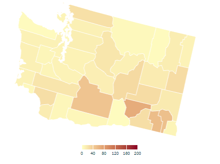
We observe that the tilted map for Washington uses a projection that is appropriate for the continental US and any states intersecting longitude -103.75 deg east. In contrast, the MazamaSpatialPlots functions will chose the most appropriate projection for each state or combination of states.
Using just the basic functionality of the countyMap() function, we can make a map that is a reasonably closes match to the original map:
����������������������������������������������������������������������������������������������������������������������������������������������������������������������������������������������������������������������������������������������������������������������������������������������������������������������������������������������������������������������������������������������������������������������������������������������������������������������������������������������������������������������������������������������������������������������������������������������������������������������������������������������������������������������������������������������������������������������������������������������������������������������������������������������������������������������������������������������������������������������������������������������������������������������������������������������������������������������������������������������������������������������������������������������������������������������������������������������������������������������������������������������������������������������������������������������������������������������������������������������������������������������������������������������������������������������������������������������������������������������������������������������������������������������������������������������������������������������������������������������������������������������������������������������������������������������������������������������������������������������������������������������������������������������������������������������������������������������������������������������������������������������������������������������������������������������������������������������������������������������������������������������������������������������������������������������������������������������������������������������������������������������������������������������������������������������������������������������������������������������������������������������������������������������������������������������������������������������������������������������������������������������������������������������������������������������������������������������������������������������������������������������������������������������������������������������������������������������������������������������������������������������������������������������������������������������������������������������������������������������������������������������������������������������������������������������������������������������������������������������������������������������������������������������������������������������������������������������������������������������������������������������������������������������������������������������������������������������������������������������������������������������������������������������������������������������������������������������������������������������������������������������������������������������������������������������������������������������������������������������������������������������������������������������������������������������������������������������������������������������������������������������������������������������������������������������������������������������������������������������������������������������������������������������������������������������������������������������������������������������������������������������������������������������������������������������������������������������������������������������������������������������������������������������������������������������������������������������������������������������������������������������������������������������������������������������������������������������������������������������������������������������������������������������������������������������������������������������������������������������������������������������������������������������������������������������������������������������������������������������������������������an>0, 200, 40),
palette = "YlOrBr",
style = "cont", # continuous color scale
legendOrientation = "horizontal",
legendTitle = "",
stateBorderColor = "white"
)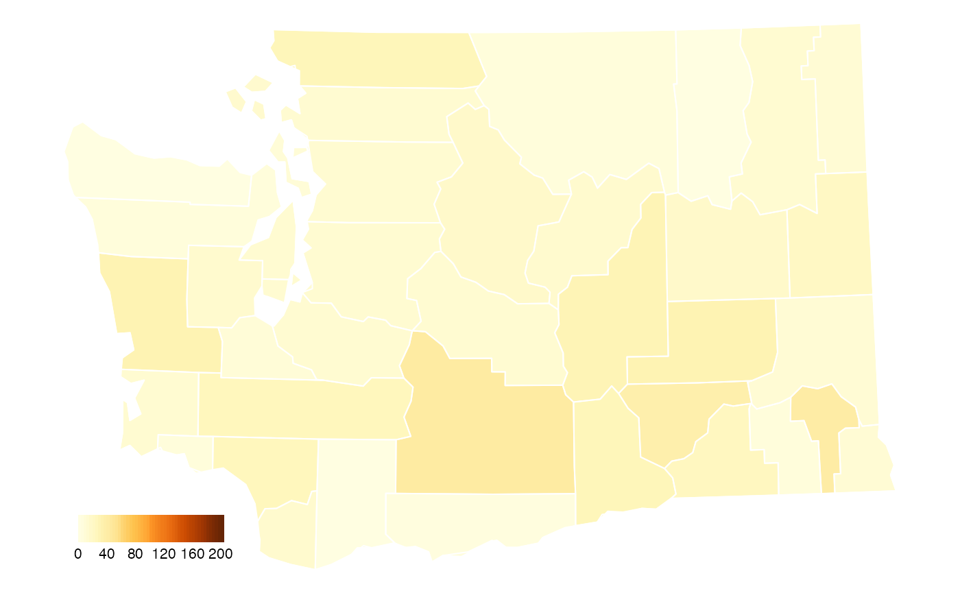
We have chosen the RColorBrewer palette that seems to be the best match for the original palette. It’s not perfect but it’s close.
The other difference between the map created with countyMap() and the original is the position of the legend. We can add adjust this manually using functions provided by tmap.
countyMap(
  data = countyCovid_formatted,
  parameter = "meanCaseRate",
  stateCode = "WA",
  breaks = seq(0, 200, 40),
  palette = "YlOrBr",
  style = "cont",
  legendOrientation = "horizontal",
  legendTitle = "",
  stateBorderColor = "white"
) + tmap::tm_layout(
    legend.position = c("center", "bottom"),
    legend.outside = TRUE,
    legend.outside.position = "bottom",
    legend.outside.size = 0.1
)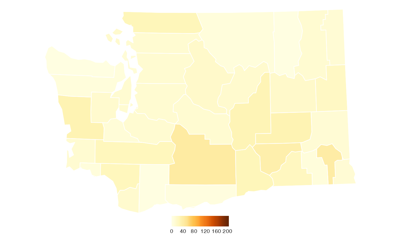
What story does this map tell? We can see that the average number of new COVID-19 cases in Washington State continue to be highest in the rural, farming counties of eastern Washington.
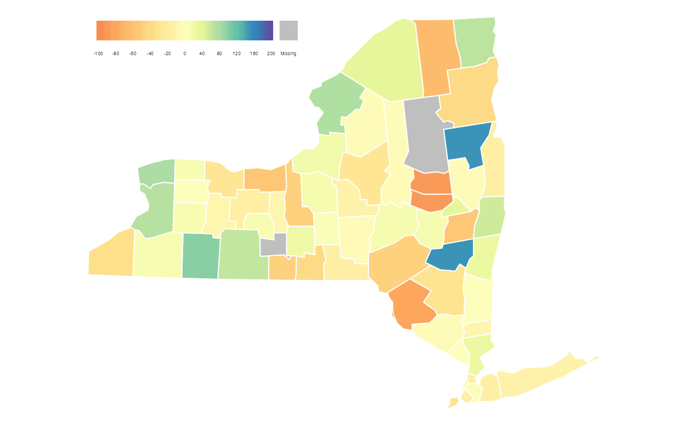
Map 2: Student Math Participation in New York Counties
The next map we will recreate is the map of change in student participation in Math in the state of New York (by county) aggregated at the end of the week. This is the map displayed on Opportunity Insights’ economic tracker:
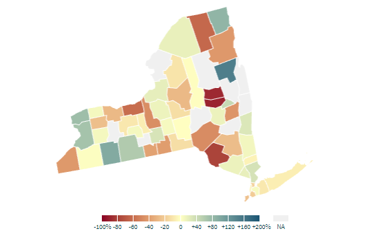
As before, we can use just the basic functionality MazamaSpatialPlots’s countyMap() function to make a map that comes close to matching the original map. One aspect that countyMap() isn’t able to replicate is the color palette used by Opportunity Insights. It appears to be some darker variation of the Spectral palette provided by RColorBrewer but we were unable to find an exact match.
mapDate <- lubridate::parse_date_time("2021 02 07", "y m d", tz = "UTC")

countyMath_formatted <- countyMath %>%
  mutate(
    date = lubridate::parse_date_time(paste(year, month, day_endofweek), "y m d", tz = "UTC"),
    countyFIPS = stringr::str_pad(countyfips, width = 5, pad = "0"),
    stateCode = US_stateFIPSToCode(substr(countyFIPS, 0, 2)),
    engagement = as.numeric(engagement) * 100.0) %>%
  dplyr::filter(date == mapDate)

countyMap(
  data = countyMath_formatted,
  parameter = "engagement",
  stateCode = "NY",
  breaks = c(seq(-100, 0, 20), seq(40, 200, 40)),
  palette = "Spectral",
  style = "cont",
  legendOrientation = "horizontal",
  legendTitle = "",
  stateBorderColor = "white"
)
Similarly to the previous example, we can adjust the position of the legend manually by using tmap. We can also add the percent (%) symbol at the end of each label in the legend. Finally, we will take the liberty of choosing a diverging color palette that better conveys which counties show increased or decreased engagement.
breaks = c(seq(-100, 0, 20), seq(40, 200, 40))

countyMap(
  data = countyMath_formatted,
  parameter = "engagement",
  stateCode = "NY",
  breaks = breaks,
  palette = "RdBu",
  style = "cont",
  legendOrientation = "horizontal",
  legendTitle = "",
  stateBorderColor = "white"
) + tmap::tm_layout(
    legend.position = c("center", "bottom"),
    legend.outside = TRUE,
    legend.outside.position = "bottom",
    legend.format = list(fun = function(x) paste0(x, "%")),
    legend.outside.size = 0.1
)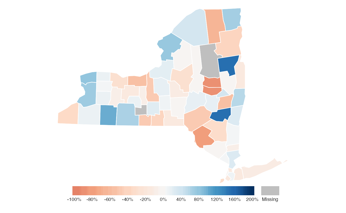
Without additional information, no clear story emerges from this map. But it does highlight several counties where additional information might reveal why they had a significant increase or decrease in student engagement.