Time range plot showing the lifespan of individual PurpleAir sensors
Source:R/pas_lifespanPlot.R
pas_lifespanPlot.RdPlots the lifespan of PurpleAir sensors – the time range between `pas$date_created` and `pas$last_seen`. You can use `dplyr::filter` and `dplyr::arrange()` to pre-process the `pas` dataframe to generate informative results
When `showSensor = TRUE`, typical values for `sensorIdentifier` would be either `sensorIndex` or `locationName`.
Usage
pas_lifespanPlot(
  pas,
  showSensor = FALSE,
  sensorIdentifier = "sensor_index",
  moreSpace = 0,
  ...
)
Arguments
- pas
PurpleAir Synoptic *pas* object.
- showSensor
Logical specifying inclusion of `pas$sensor_index` in the plot.
- sensorIdentifier
Name of the column to use when identifying a sensor.
- moreSpace
Fractional amount which to expand the time axis so as to allow more room for sensorIdentifiers.
- ...
Additional arguments to be passed to graphics::plot.default().
Examples
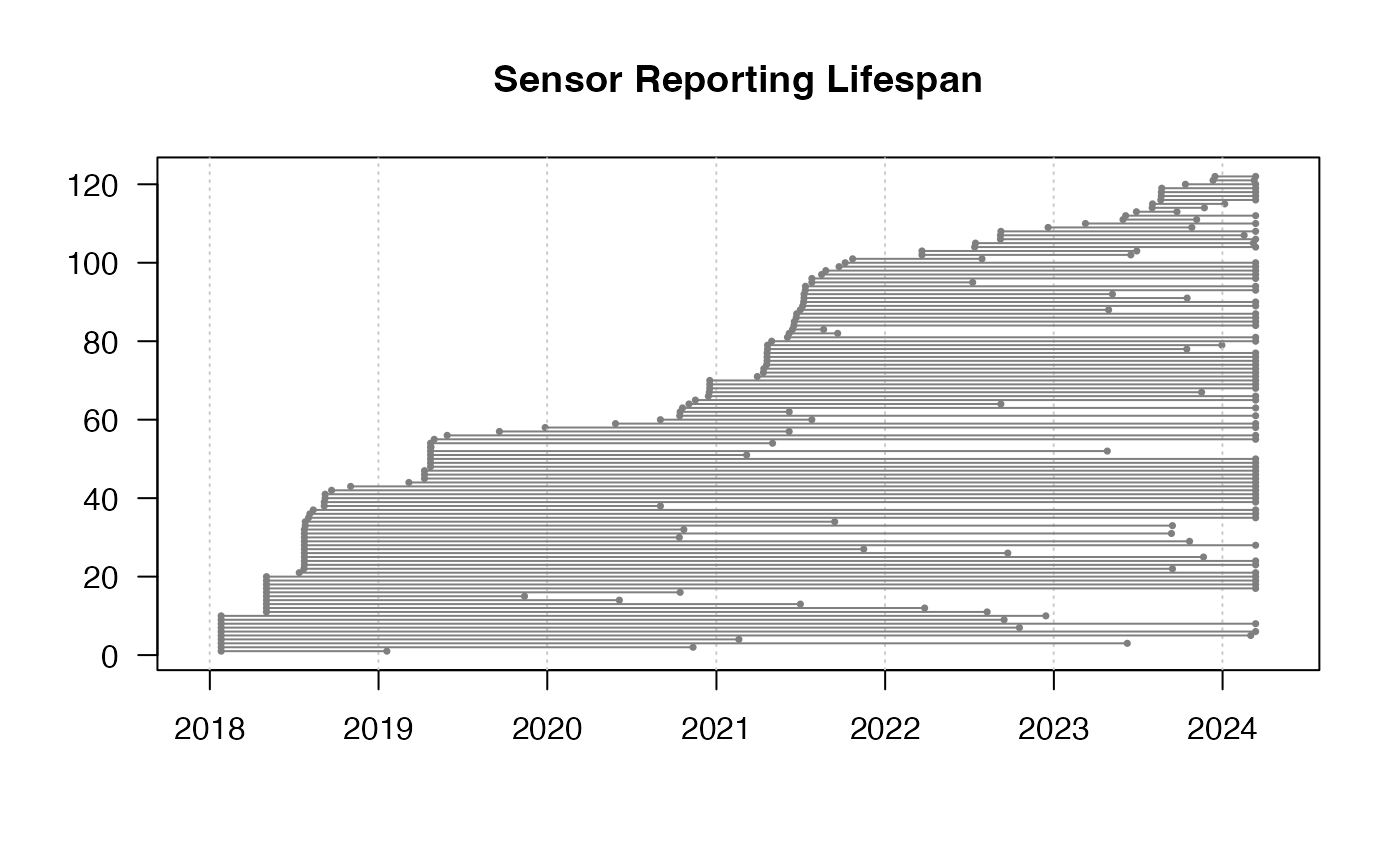
library(AirSensor2)
# Plot all lifespans
example_pas_historical %>%
pas_lifespanPlot()
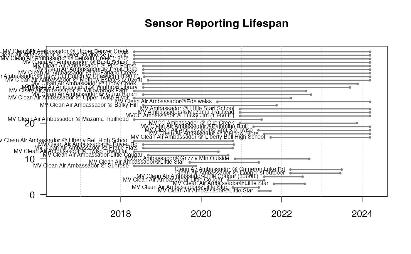
 # Methow Valley Clean Air Ambassador sensors
example_pas_historical %>%
pas_filter(stringr::str_detect(locationName, "Ambassador")) %>%
pas_lifespanPlot(
showSensor = TRUE,
sensorIdentifier = "locationName",
cex = .6,
lwd = 2,
moreSpace = .3
)
# Methow Valley Clean Air Ambassador sensors
example_pas_historical %>%
pas_filter(stringr::str_detect(locationName, "Ambassador")) %>%
pas_lifespanPlot(
showSensor = TRUE,
sensorIdentifier = "locationName",
cex = .6,
lwd = 2,
moreSpace = .3
)
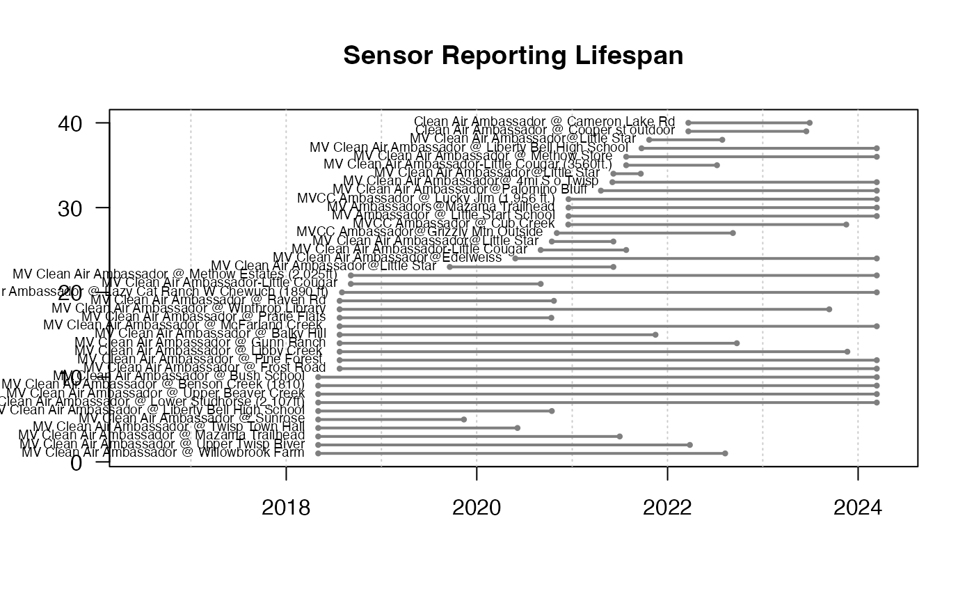 # Arrange by lifespan
example_pas_historical %>%
pas_filter(stringr::str_detect(locationName, "Ambassador")) %>%
dplyr::mutate(lifespan = last_seen - date_created) %>%
dplyr::arrange(lifespan) %>%
pas_lifespanPlot(
showSensor = TRUE,
sensorIdentifier = "locationName",
cex = .6,
lwd = 2,
moreSpace = .3
)
# Arrange by lifespan
example_pas_historical %>%
pas_filter(stringr::str_detect(locationName, "Ambassador")) %>%
dplyr::mutate(lifespan = last_seen - date_created) %>%
dplyr::arrange(lifespan) %>%
pas_lifespanPlot(
showSensor = TRUE,
sensorIdentifier = "locationName",
cex = .6,
lwd = 2,
moreSpace = .3
)