Introduction to MazamaSpatialPlots
Rachel Carroll, Mazama Science
2022-11-07
Source:vignettes/MazamaSpatialPlots.Rmd
MazamaSpatialPlots.RmdBackground
Maps colored by state and county (aka “chloropleth maps”) are among the most common data graphics and are used to convey everything from vote totals to economic and health statistics. Well designed maps involve a careful choice of map projections and colors for both the state/county fill and boundary lines. Unfortunately, creating beautiful maps in R is still somewhat involved.
The MazamaSpatialPlots package provides plotting functionality to make it as easy as possible to produce beautiful US state and county level maps. It builds on the excellent tmap package and harnesses datasets from the MazamaSpatialUtils package. High-level plotting functions make it easy for users to create beautiful chloropleth maps. The underlying code uses ggplot2 so users familiar with ggplot2 can easily enhance the returned plot objects to create highly customized plots.
Installation
This package is designed to be used with R (>= 3.5) and RStudio so make sure you have those installed first.
Users will want to install the devtools package to have access to the latest development version of the package from GitHub.
The following packages should be installed by typing the following at the RStudio console:
# Note that vignettes require knitr and rmarkdown
install.packages('knitr')
install.packages('rmarkdown')
install.packages('MazamaSpatialUtils')
devtools::install_github('MazamaScience/MazamaSpatialPlots')
MazamaSpatialPlots requires spatial polygon data to plot the shapes of states and counties. These spatial datasets are provided by MazamaSpatialUtils and can be installed by running the following in the RStudio console:
library(MazamaSpatialUtils)
dir.create('~/Data/Spatial', recursive = TRUE)
setSpatialDataDir('~/Data/Spatial')
installSpatialData("USCensusStates_02")
installSpatialData("USCensusCounties_02")
Features
Currently, MazamaSpatialPlots contains high level functions for creating choropleth maps for US counties and states:
-
countyMap()- plot a choropleth map for county level data. Uses theUSCensusCounties_02dataset for spatial polygons. -
stateMap()- plot a choropleth map for state level data. Uses theUSCensusStates_02dataset for spatial polygons.
Additionally, MazamaSpatialPlots provides two example datasets formatted for use with the package’s functions:
-
example_US_stateObesity- state level obesity rate -
example_US_countyCovid- county level COVID19 cases and deaths
Input Data
The SpatialPolygonsDataFrame used to create a state or county map is provided by the MazamaSpatialUtils package once that is installed.
State-level data
User provided data must be provided as simple dataframes. For the
stateMap() function, the data input dataframe
must have a stateCode column containing the 2-character US
state code. Any other column of data can be used as the
parameter by which states will be colored.
The following functions from MazamaSpatialUtils can
help in creating the stateCode column if it does not
already exist:
County-level data
For county maps, the input data must contain a
countyFIPS column uniquely identifying each county. The
MazamaSpatialUtils::US_countyCodes dataset can be used to
determine the countyFIPS codes.
Example Maps
Example state map
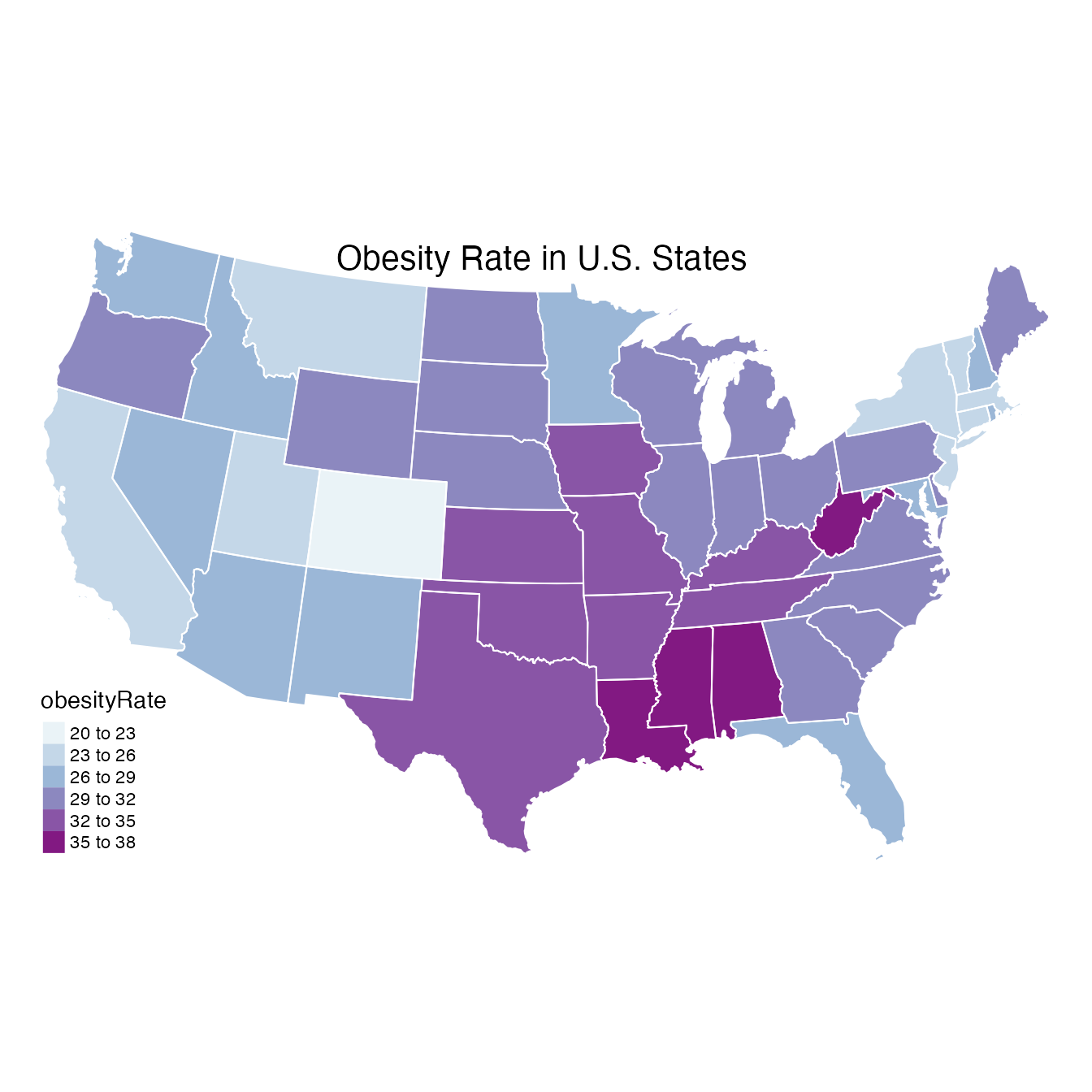
Here we create a state map using the package
example_US_stateObesity dataset showing the obesity rate
for each state in the United States. A single call to the
stateMap() function is all that is required. Customization
is performed entirely through function arguments.
library(MazamaSpatialPlots)

# Look at input data
head(example_US_stateObesity)
#>   stateCode  stateName obesityRate
#> 1        TX      Texas        32.4
#> 2        CA California        24.2
#> 3        KY   Kentucky        34.6
#> 4        GA    Georgia        30.7
#> 5        WI  Wisconsin        30.7
#> 6        OR     Oregon        30.1
# Create the map
stateMap(
  data = example_US_stateObesity,
  parameter = 'obesityRate',
  breaks = seq(20, 38, 3),
  palette = 'brewer.bu_pu',
  stateBorderColor = 'white',
  title = "Obesity Rate in U.S. States"
)
Example county map
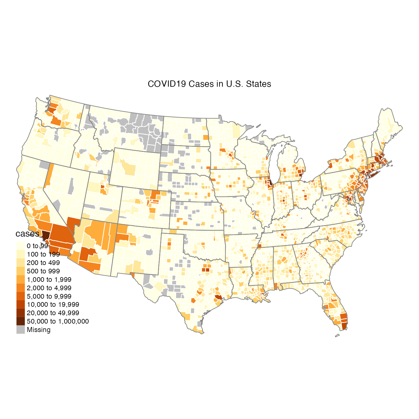
For the countyMap() example, we use COVID19 case data
from June 01, 2020.
# Look at the input data
head(example_US_countyCovid)
#> # A tibble: 6 × 6
#>   stateCode stateName countyFIPS countyName cases deaths
#>   <chr>     <chr>     <chr>      <chr>      <int>  <int>
#> 1 AL        Alabama   01001      Autauga      234      5
#> 2 AL        Alabama   01003      Baldwin      306      9
#> 3 AL        Alabama   01005      Barbour      173      1
#> 4 AL        Alabama   01007      Bibb          79      1
#> 5 AL        Alabama   01009      Blount        65      1
#> 6 AL        Alabama   01011      Bullock      210      6
# Create the map
countyMap(
  data = example_US_countyCovid,
  parameter = "cases",
  breaks = c(0,100,200,500,1000,2000,5000,10000,20000,50000,1e6),
  countyBorderColor = "white",
  title = "COVID19 Cases in U.S. States"
)