Customizing State Maps
Rachel Carroll, Mazama Science
July 25, 2020
Source:vignettes/articles/Customizing_State_Maps.Rmd
Customizing_State_Maps.RmdObjective
The goal of this document is to serve as a tutorial for creating customized maps of U.S. states and territories by using custom projections or the tmap package.
Using projections
In general, the default projections in stateMap() are appropriate for common state groupings. However, the projection parameter can be used to override the default projections as needed.
Below is an unusual group of states with the default projection.
library(MazamaSpatialPlots)

northernStates <- c("AK", "WA", "ID", "MT", "ND", "MN", "WI",
                    "MI", "OH", "PA", "NY", "VT", "NH", "ME")

stateMap(
  data = example_US_stateObesity,
  parameter = 'obesityRate',
  palette = 'YlOrRd',
  breaks = seq(23, 33, 2),
  stateCode = northernStates,
  stateBorderColor = 'black',
  title = "Obesity Rate in Northern U.S. States"
)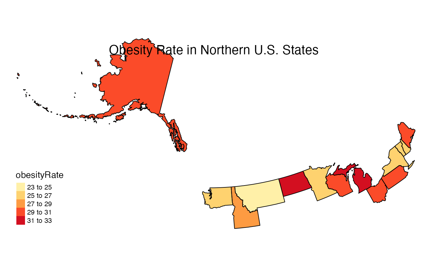
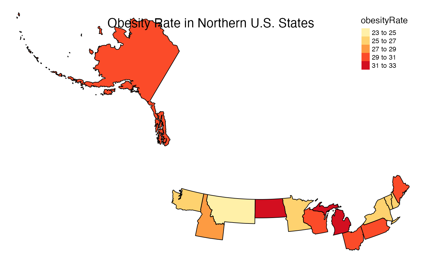
The projection is oddly rotated in this case. To remedy this, a manual projection can be defined:
myproj <- "+proj=lcc +lat_1=32.5 +lat_2=71.4 +lat_0=51.9 +lon_0=-102.9 +x_0=0 +y_0=0 +datum=NAD83 +units=m +no_defs"
stateMap(
  data = example_US_stateObesity,
  parameter = 'obesityRate',
  palette = 'YlOrRd',
  breaks = seq(23, 33, 2),
  stateCode = northernStates,
  projection = myproj,
  stateBorderColor = 'black',
  title = "Obesity Rate in Northern U.S. States"
)
Customizing with the tmap Package
One benefit of using stateMap() is that the output is a ggplot2 object. Therefore, maps can be further customized using functionality from the tmap and ggplot2 packages. Many visual adjustments including legend and title locations, fonts, and background colors can be made by simply appending your stateMap() plot with arguments in tmap::tm_layout(). Furthermore, tmap::tm_style() can be used to leverage built in styles and tmap::tm_compass() can be used to add a compass to your map. The three examples below demonstrate how to build customized visualizations using both stateMap() parameters and tmap functionality.
Using tmap::tm_layout()
stateMap(
  data = example_US_stateObesity,
  parameter = "obesityRate",
  breaks = seq(20,38,3), #increasing color detail
  conusOnly = FALSE ,
  stateBorderColor = 'black',
) +
  tmap::tm_layout(
    frame = TRUE,
    main.title = 'Obesity Rates in U.S. States and Territories',
    main.title.position = c("center", "top"),
    title.fontface = 2,
    fontfamily = "serif",
    bg.color = "grey85",
    inner.margins  = .05,
    legend.position = c('right', 'top')
) 
Using tmap style “classic” and a compass
stateMap(
  data = example_US_stateObesity,
  parameter = "obesityRate",
  breaks = seq(20,40,4),
) +
  tmap::tm_style(
    'classic'
  ) +
  tmap::tm_layout(
    title = 'Obesity Rate by State',
    title.position = c("center", "top"),
    title.size = 1.2,
    inner.margins  = .08
  ) +
tmap::tm_compass() 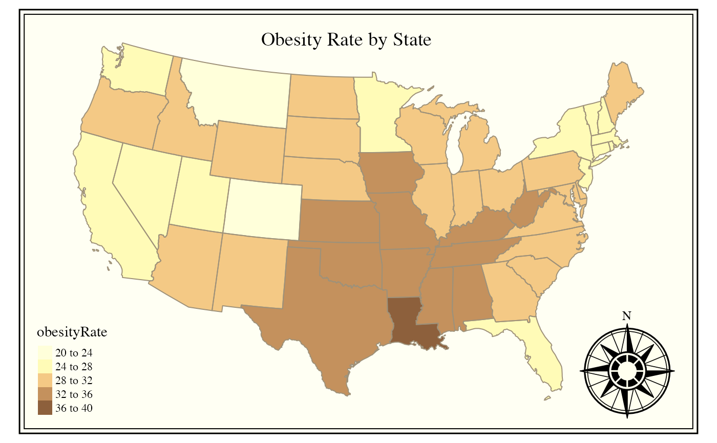
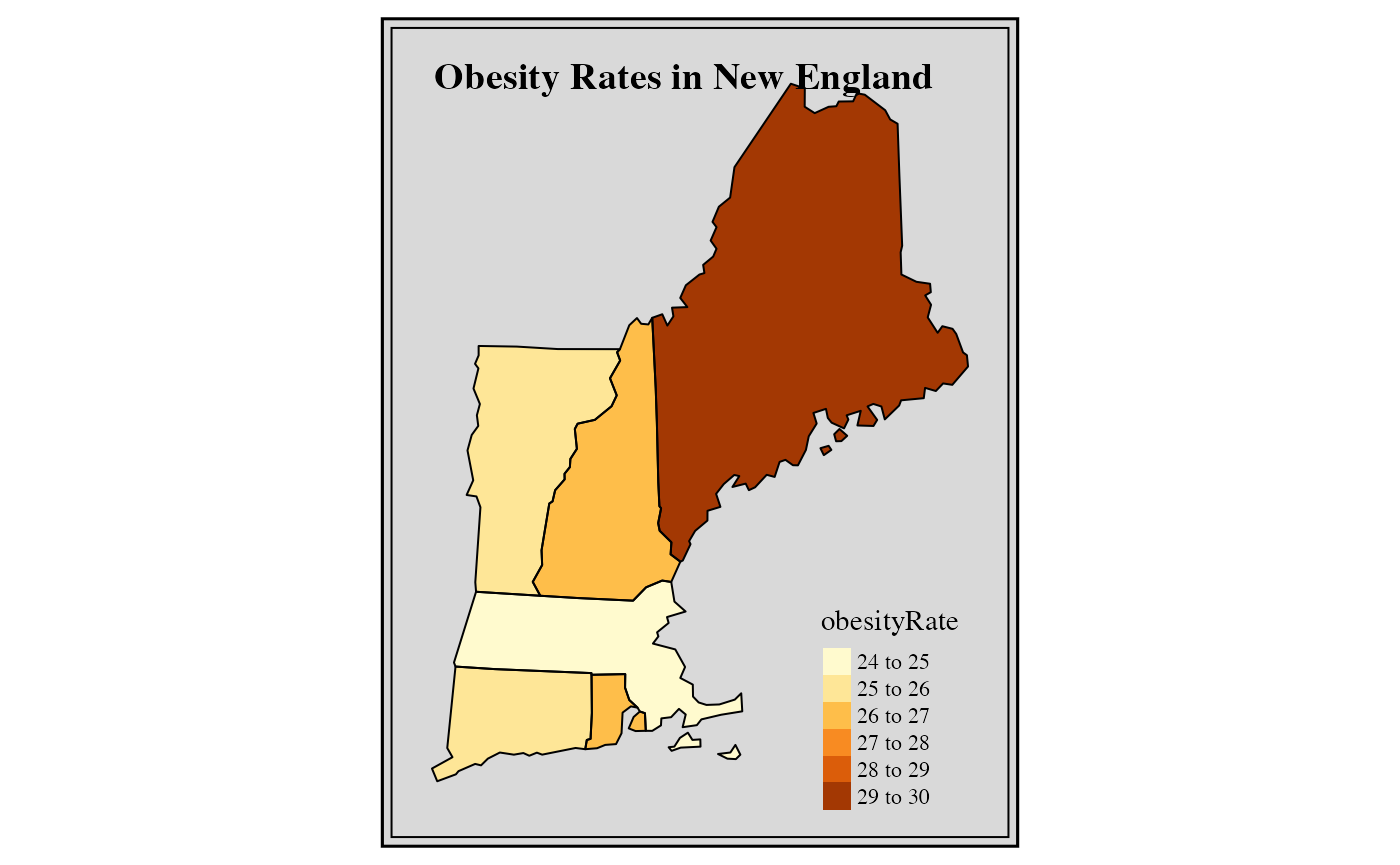
Fancy New England regional map
stateMap(
 data = example_US_stateObesity,
 parameter = "obesityRate",
 stateCode = c('ME', 'NH', 'VT', 'MA', 'RI', 'CT'),
 stateBorderColor = 'black',
 title = 'Obesity Rates in New England'
) +
 tmap::tm_layout(
   frame = TRUE,
   frame.double.line = TRUE,
   title.size = 1.2,
   title.fontface = 2,
   fontfamily = "serif",
   bg.color = "grey85",
   inner.margins  = .08
 )
Conclusion
The stateMap() function allows us to create attractive maps very efficiently and with a lot of flexibility. The function creates highly customized visualizations through direct inputs and by harnessing the functionality of the tmap package.